


Services Provided
- Product Packaging Redesign
- Brand Identity Refresh
- Product Line System Design
- Typography & Information Hierarchy
- Color Palette Development
- Print Production & Press-Ready Files
- QR Code Integration
- Product Authentication Seal Design
- User Experience Strategy
- Packaging Layout & Production Artwork
Details & Info
3Bitters — Product Packaging Redesign & Brand Refresh
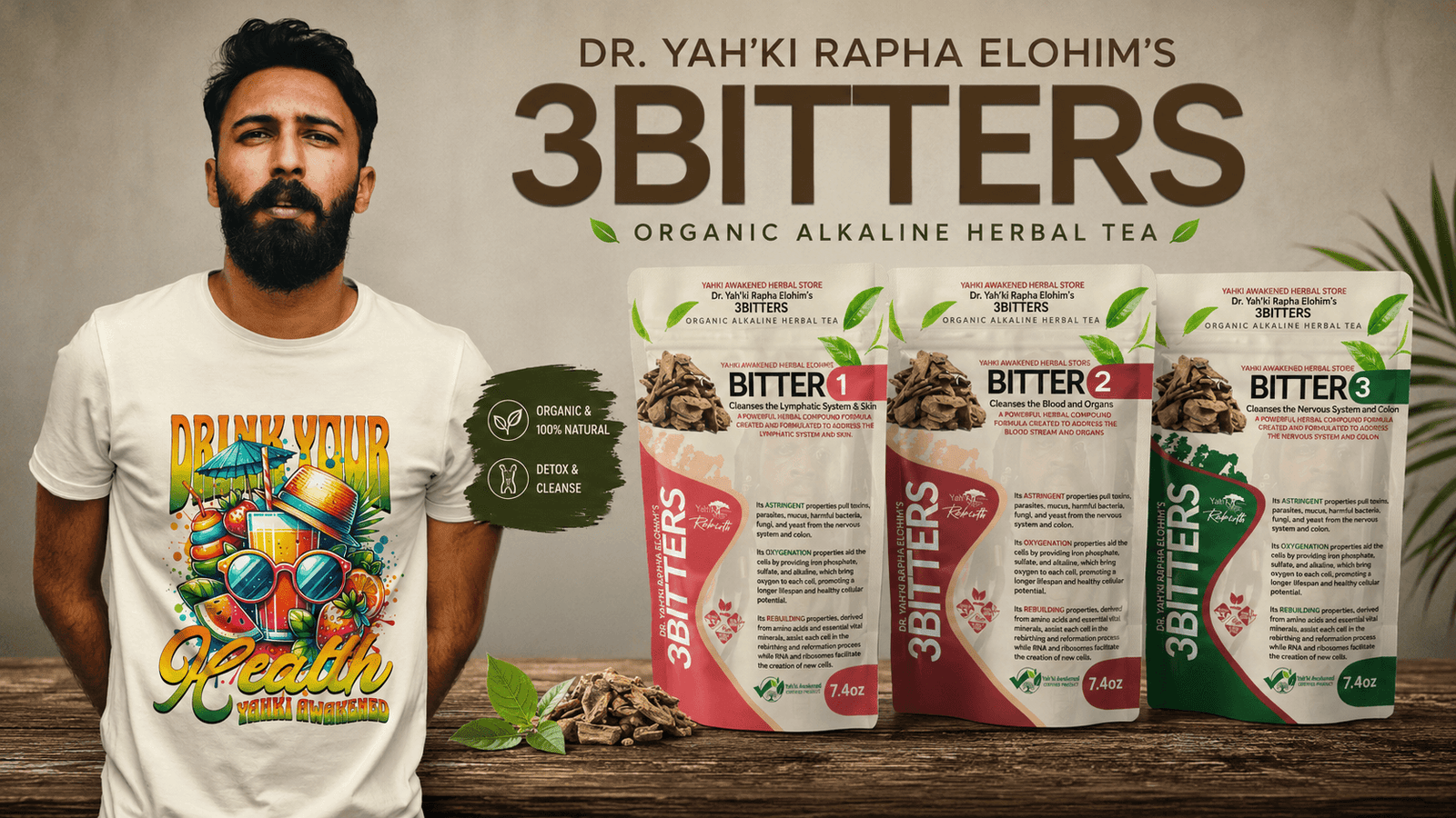
This project centered on the complete redesign of one of Yah’ki Awakened’s most recognized herbal product lines. The objective was to modernize the packaging while preserving the trust and recognition the 3Bitters brand had already established among its loyal customer base.
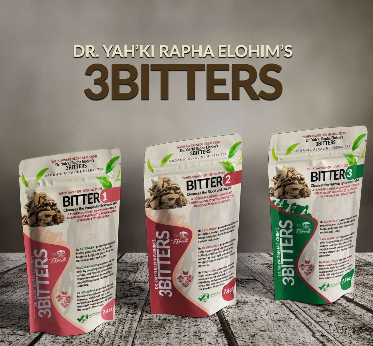
Inspired by Pantone’s 2024 Color of the Year, Peach Fuzz, I developed a fresh visual direction that introduced warmth, sophistication, and a more premium retail presence. The updated color palette softened the overall presentation while maintaining the natural, wellness-focused identity of the brand.
The redesign extended across the complete product line—including Bitter 1, Bitter 2, and Bitter 3—creating a consistent packaging system while allowing each formula to remain easily distinguishable through strategic color coding and product hierarchy. Large, highly legible typography improves shelf visibility, while flowing graphic elements guide the eye naturally through the packaging and reinforce the relationship between all three products.
Beyond aesthetics, this project focused heavily on improving the customer experience. I integrated QR codes directly into each package, allowing customers to instantly access preparation instructions and product information without cluttering the label with excessive text. This created a cleaner design while making information more accessible across digital devices.
To help protect both the brand and its customers from counterfeit products being sold through unauthorized online marketplaces, I also conceptualized and designed the Yah’ki Awakened Certified Product verification seal. The certification mark provides an immediate visual indicator of authenticity while strengthening consumer confidence and reinforcing the integrity of the brand.
From the typography, layout, color system, information hierarchy, iconography, packaging structure, and production-ready artwork to the implementation of security-focused branding elements, every detail was carefully designed to create packaging that is both visually compelling and functionally effective.
This project showcases my ability to modernize an established product line, improve usability, strengthen brand recognition, and develop packaging solutions that solve real business challenges beyond aesthetics alone.
Rather than designing three individual packages, I developed a scalable packaging system that allows future products to be added to the line while maintaining immediate brand recognition and visual consistency.